

Ozone in the Troposphere
Data Taste
Data Byte
Data Dive
Glossary & Resources
Step 1: Locating Data View and Using Data Viewer
The Earth Systems Research Laboratory’s Global Monitoring Laboratory of the of the National Oceanic and Atmospheric Administration (NOAA) conducts research that addresses three major challenges; greenhouse gas and carbon cycle feedbacks, changes in clouds, aerosols, and surface radiation, and recovery of stratospheric ozone.
Visit this page to begin exploring datasets
Locate the “Research Tab” within the blue header banner and choose “Ozone and Water Vapour” and click on the tab to bring you to the landing page. https://gml.noaa.gov/ozwv/
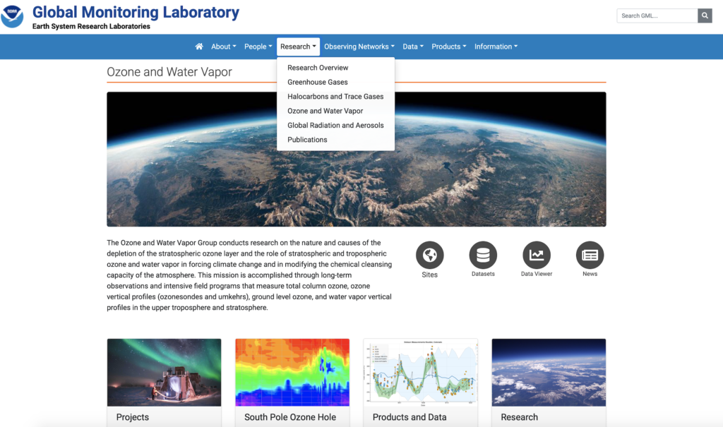
In this DataTaste you will be exploring Ozone data. Locate the circular widgets on this page to select “Data Viewer”. Once you select “Data Viewer” you will be relocated to a world map of all locations that various Ozone and Water Vapour data is collected.
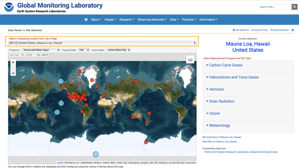
Begin by exploring a few different locations around the globe for Ozone data. You can change the location of the data you would like to view by clicking the “Select a Sampling Location from the List or Map” which is the first dropdown menu on the page.
Utilize the location dropdown menu to practice switching different sites around the globe. Use the mouse to hover over locations on the map to understand the different atmospheric measurements that are monitored at that site.
The first location to explore is the code (MLO) Mauna Loa, Hawaii
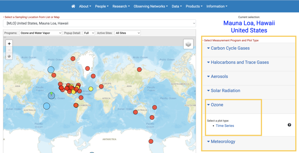
Once you have changed the location to Mauna Loa, Hawaii you will see data tabs in grey boxes on the right-hand side. Click the down arrow under “Ozone” to reveal “Time Series”. Select “Time Series” to be redirected to a data plotter.
You are now finished Step 1. Great job!
Step 2: Exploring Ozone Data in Plotter l Subset Data for a Single Year
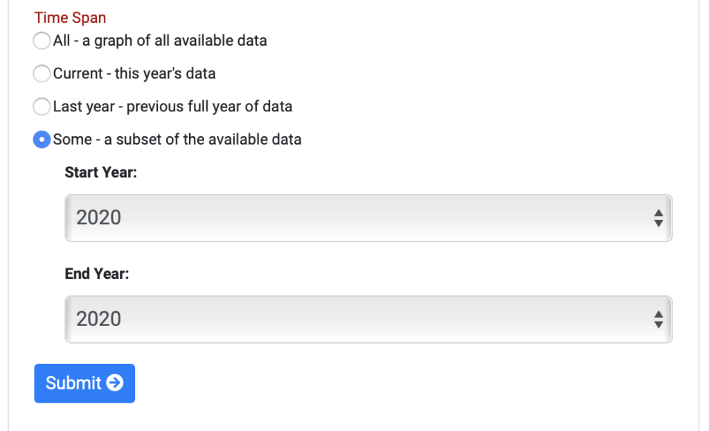
The DataPlotter function allows you to look at different time spans of data to look graphically at trends and see the data projected in line graph format. Let’s first subset the data for a particular set of years. You can do this by choosing “Some- a subset of available”
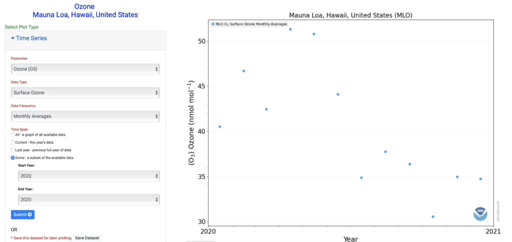
Click on “subset of available” and choose a single year of 2020. Click the blue button at the bottom labelled “Submit” for the graph to appear in the right-hand column.
In the right hand of your screen you will see a graph for a single year beginning in January and ending in December appear.
QUESTION PROMPT FOR ANSWER
What month is ozone the highest for station Mauna Loa, Hawaii?
What month is ozone the lowest for station Mauna Loa, Hawaii?
Once you have answered the prompt go to the bottom left-hand corner of the graph to create a .PDF version for your analysis.
Save this graph as Mauna_Loa_Hawaii_2020_Ozone.
Step 3: Exploring Ozone Data in Plotter l Subset Data for a Time Span
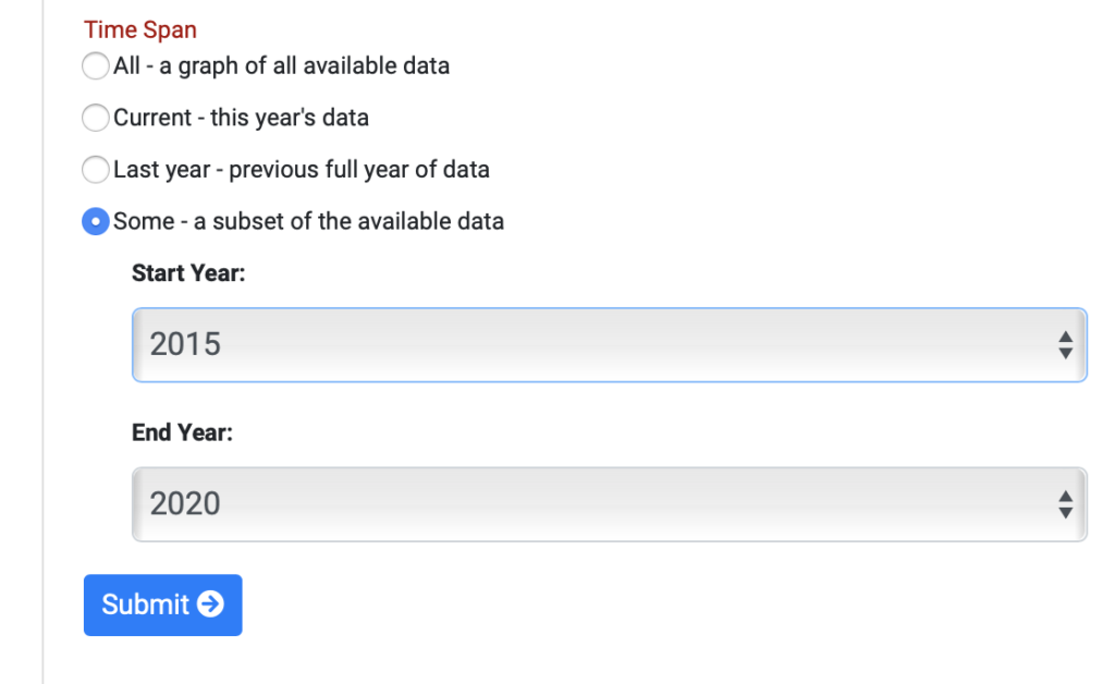
The next step is to utilize the data plotter to see if trends seen in one year, hold over multiple years. To do this in the DataPlotter go to “Some- a subset of the available data” and choose the year of 2015 to 2020.
*Note to make sure you are still in the correct data location of Mauna Loa, Hawaii.
Investigate the trends, what times of year are the highest in Ozone, lowest? Is there a seasonal trend from 2015-2020?
Make sure to write down notes for the trends that you see in the data.
Additionally record what a “high” value is for this location and ensure to note your units of measurement of ozone found on the “y-axis”.
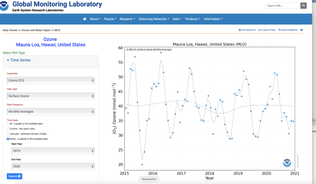
Save your graph by utilizing the create a .PDF version for your analysis.
Save this graph as Mauna_Loa_Hawaii_2015_2020_Ozone.
Now you know how to subset data for a single location and timespan.
Step 4: Exploring a Data Plot for a New Location
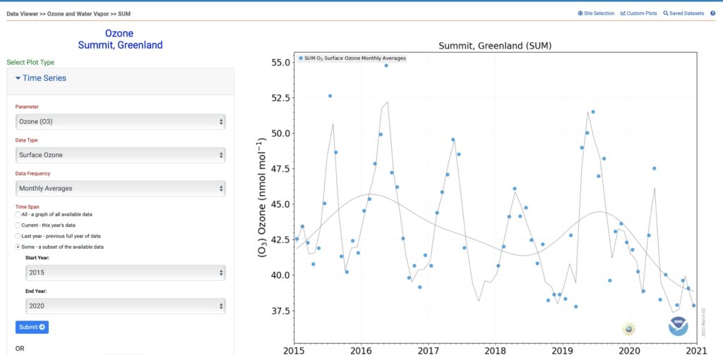
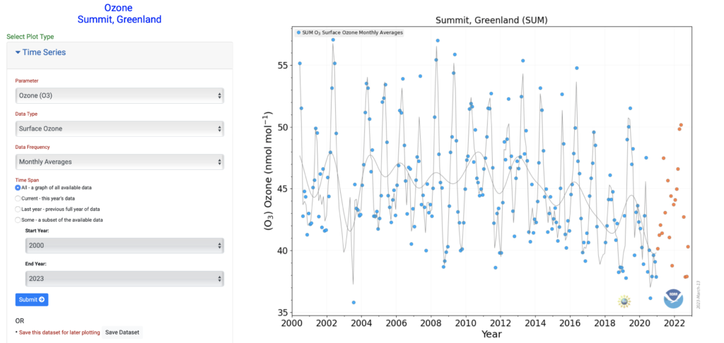
The next location to explore is Greenland, Summit (Code: SUM).
In the upper right-hand corner in small blue print, you will see the listing of “Site Selection”. This will allow the user to select a new location to further explore Ozone.
Choose SUM Summit Greenland.

Practice subsetting the data by the year “2020”
What month is ozone the highest for station Greenland, Summit?
What month is ozone the lowest for station Greenland, Summit?
Save your graph as Summit_Greenland_2020_Ozone.
Next practice subsetting the data by the year range of “2015-2020” and look for seasonal trends.
Save your graph as Summit_Greenland_2015-2020_Ozone
Investigate the trends, what times of year are the highest in Ozone, lowest? Are there seasonal trends from 2015-2020? Record notes on the trends that you see in these data.
Additionally record what the “high” and “low” values are for this location and the units that ozone was measured in, which can be found on the y-axis of the graph.
What happens when “All- a graph of all available data” is selected in the left hand panel for Summit, Greenland do those same trends appear in the larger dataset (2000-present)?
Utilize a program such as a PowerPoint or Google Slide to allow you to see graphs side by side.
Step 5: Querying the Data
The graphs produced in step 3 and 4 lay the groundwork to understand how atmospheric circulation patterns may affect the amount of surface Ozone recorded at these locations. Spring (April, May) have been recorded has having the highest values of Ozone (PPB) for both locations. Let’s look at the meteorology of Hawaii to begin to draw some conclusions.
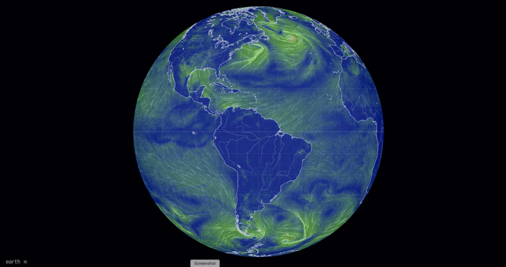
Navigate to Earth Null School
Earth Null school is a website that provides a visualization of global weather conditions using data from various models. This tool will enable you to explore larger patterns in the data collected in this lesson. The landing page should look like the image below. Click the “Earth” in the bottom left-hand corner of the page to open the data window.
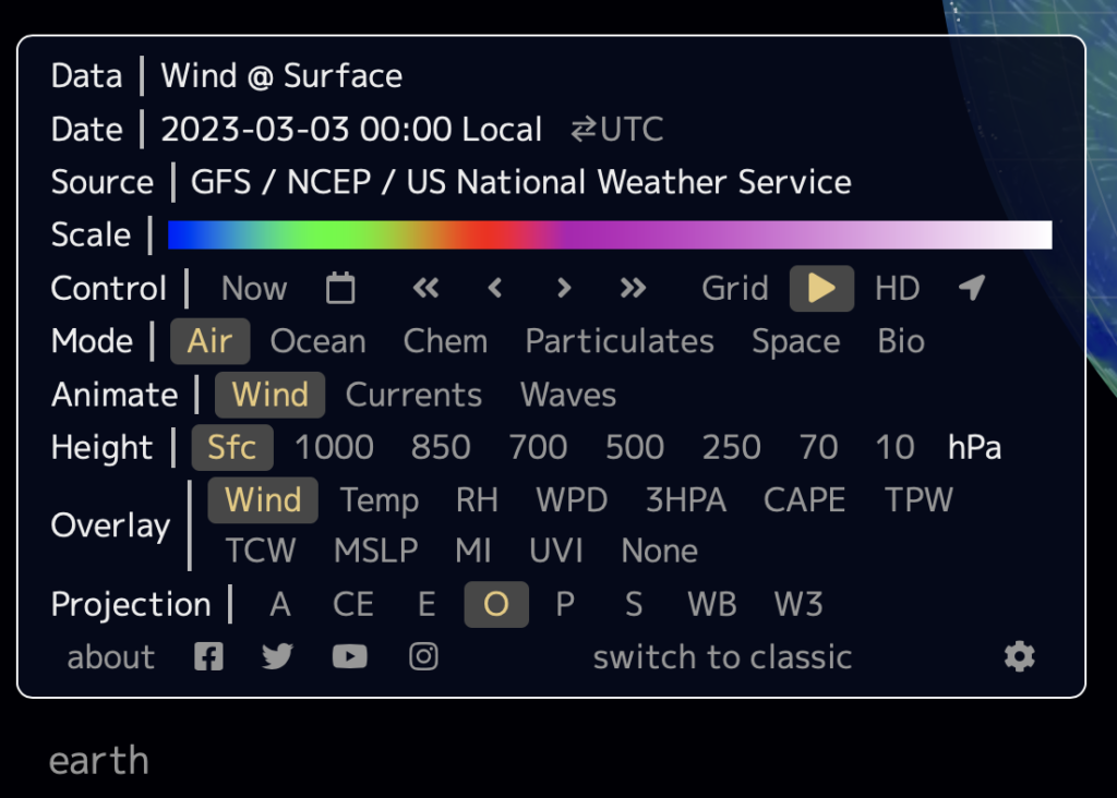
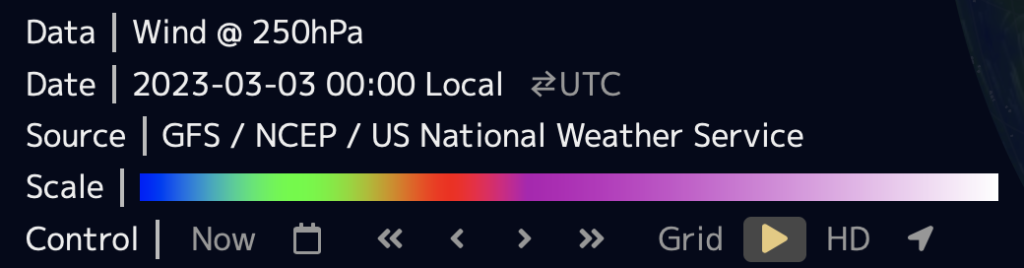
The first parameter to examine are the jet streams and to do this you will need to ensure the below:
- Mode: Air
- Animate: Wind
- Height: 250 hPA
- Overlay: Wind
The map should look similar to the below. Proceed to practice moving the globe around and zooming in to different locations. Take some time to investigate the overlays and get familiar with this tool.
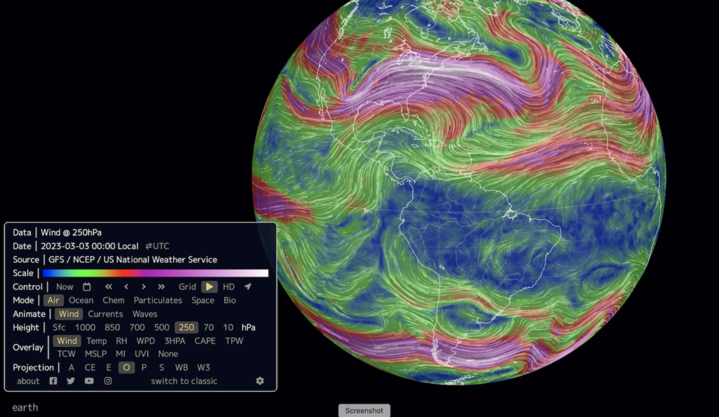
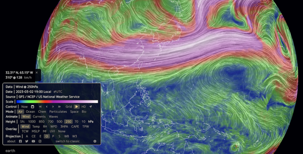
The jet streams are fast-moving, narrow bands of air currents in the upper atmosphere that flow from west to east. There are two main jet streams, the polar jet stream and the subtropical jet stream.
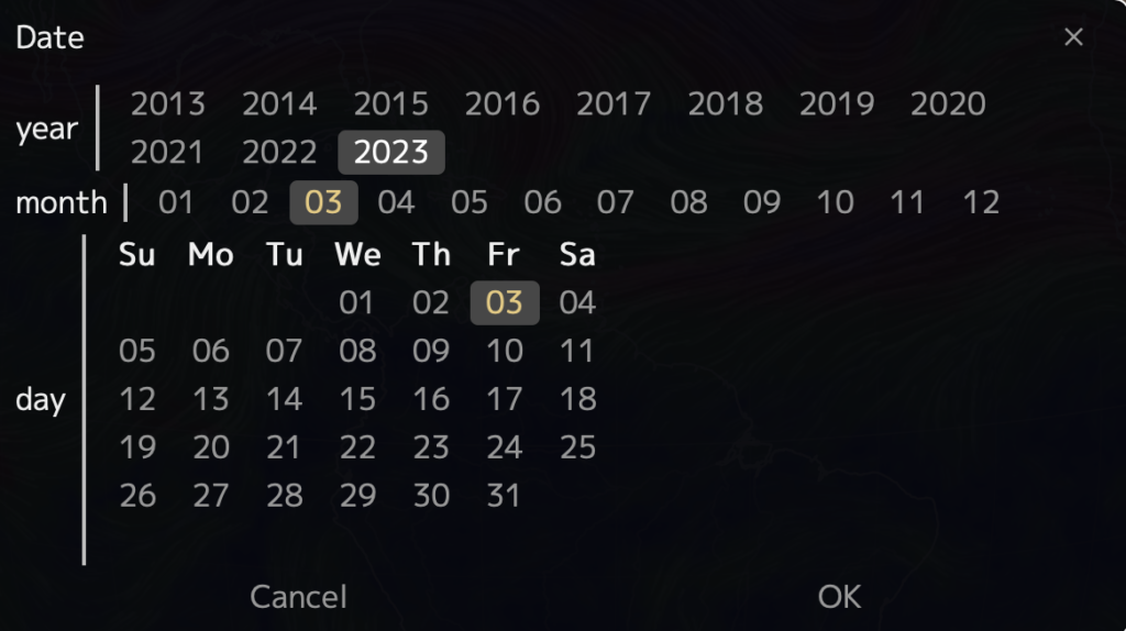
Earth Null School has a function to look at historical data. Navigate to Control on the left-hand side of the data panel and locate the calendar.
Click on the calendar and a pop-up window with year, month and date selection will appear. Examine the polar jet stream in the northern hemisphere.
Does the position of the jet stream shift over the course of a calendar year?
Here is a recording of the movement of the polar jet stream over North America in the year 2020. Watch the recording over a single year to answer the next question prompt?
2020 Jet Stream from Kaitlin Noyes on Vimeo.
Does the speed of the jet stream change over the course of a calendar year?
In the Northern Hemisphere, when does the jetstream shift northward in summer or winter?
Examine and make notes on the two locations, Hawaii and Greenland and how the position of the jet stream seasonally may impact wind patterns. Toggle between the jet stream at 250 hPA and surface winds (Sfc).
Do surface currents (Sfc) always move the same direction as the jet streams?
In the next step you will examine pressure. Update your data panel selections to the below.
- Mode: Air
- Animate: Wind
- Height: Sfc
- Overlay: MSLP
MSLP stands for Mean Sea Level Pressure and it is the average pressure at sea level over a period of time. It is important to forecasters in understanding the movement and intensity of weather systems. Locate areas of high sea level pressure over the Atlantic and Pacific Ocean basins by locating clockwise rotations of pale-blue-grey. These semi-permanent clockwise swirling air masses are the locations of subtropical high pressure. The darker purple masses are low pressure systems.
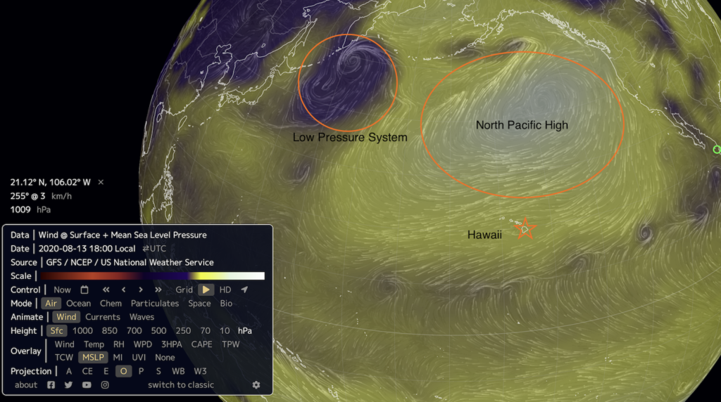
Return to the calendar prompt under Control and change the date to look at the general pattern and position of these low and high-pressure systems.
Do the location of the subtropical high-pressure systems change seasonally?
Zoom into Hawaii on your map.
Through your data search you have now uncovered that the subtropical high-pressure system and low-pressure systems move seasonally. The movement of air masses from high to low pressure plays a key role in shaping our weather. Over Hawaii, during the summer months (May-September), the subtropical high-pressure system centered over the Pacific Ocean moves northward, resulting in the trade winds blowing from the northeast. The trade winds are the prevailing winds in Hawaii and are generally moderate to strong.
During the winter months (October-April), the subtropical high-pressure system moves southward, resulting in the trade winds blowing from east or southeast. These trade winds are often weather during the winter months can shift south leading to light and variable winds in some areas.
Toggle between surface current winds in January verses June of 2020 over Hawaii, can you see the wind pattern and speed shift around the islands in the model?
On small oceanic islands like Hawaii source points of ozone pollution are relatively low. The graph you created demonstrate a distinct seasonal variability. Much of the Ozone seasonally arriving to the ocean basin is generated elsewhere and delivered to Hawaii through long range transport in the jet stream.
Return to an analysis of the polar jet stream moving from west to east.
From what continent would air mass sources be coming from to Hawaii in the transition between winter and spring?
Step 6: Making Conclusions from the Hawaii Data
Now you have a really good understanding on how to view datasets in the DataPlotter function and a general understanding of seasonality of ozone in Hawaii.
With your graphs of Station Mauna Loa in front of you, make some conclusions about your data based on what you now know about the meteorology of the North Pacific. In your conclusion, list the primary ingredients needed in the formation of tropospheric ozone. Use the below resources to help to explain the seasonality of tropospheric ozone over Station Mauna Loa, Hawaii.
Resources
- Tropospheric ozone trends at Mauna Loa Observatory tied to decadal climate variability
- Pacific Exploratory Mission in the Tropical Pacific: PEM-Tropics B, March-April 1999
- What does an atmospheric river look like?
- Transport and Chemical Evolution over the Pacific (TRACE-P) aircraft mission: Design, execution, and first results
- Asian chemical outflow to the Pacific in spring: Origins, pathways, and budgets
- NASA-LARC
- PEM Tropics Map
Step 1: Locating Datasets
Visit this page to begin exploring datasets:
Locate the “Research Tab” within the blue header banner and choose “Ozone and Water Vapour” and click on the tab to bring you to the landing page.
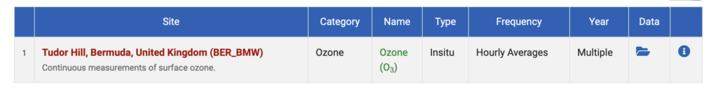
In this DataByte you will be exploring Ozone data at Tudor Hill Atmospheric Observatory in Bermuda. Locate the grey circles on this page to select “Datasets. The page will relocate the user to a list of all Sites that various Ozone and Water Vapour data are collected.

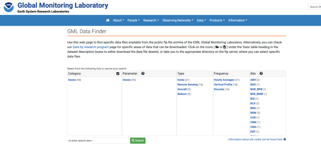
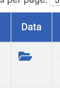
Select from the list the code BER_BMW from the Site List, or utilize the Search function and type “Bermuda” and be routed to “Tudor Hill, Bermuda, United Kingdom (BER_BMW). Select the file folder icon under the column heading “Data” to explore all data existing in the repository for this site. Explore the data files to learn more about the timing of data collection and how metadata is recorded.
Step 2: Exploring the Metadata
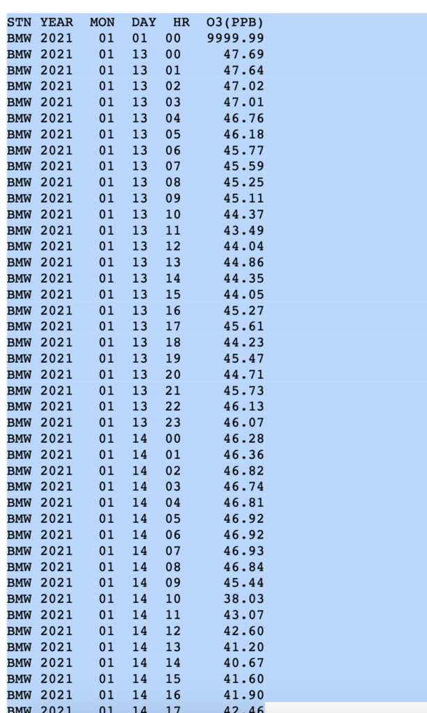
Explore the folders to discover how annual data is collected, under what time intervals and units. It is important to understand the metadata to make sure the dataset is consistent before downloading for analysis.
Question Review
In the metadata provided in the data files for station BWM what are the units that Ozone (O3) is measured in?
When looking at the 2014 folder for station BWM, what are the two time intervals of sampling that the metadata describes?
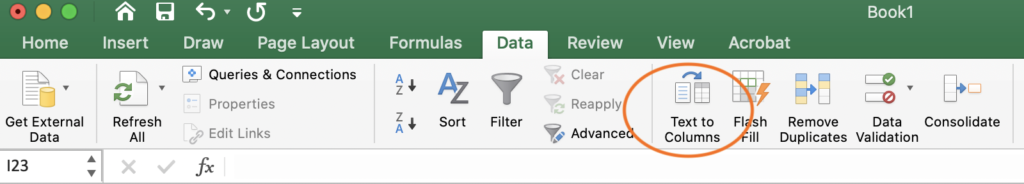
Step 3: Practicing Text to Columns in Microsoft Excel
Any of the datasets explored could be imported into Microsoft Excel for manipulation to better understand annual and inter-annual trends in surface Ozone. In this lesson, participants will practice bringing in the data from the NOAA data repository into Excel.
First, choose a year and month that you are interested in exploring. In this example, January of 2021 was chosen. Highlight the entire dataset and utilize control “C” or Command “C”.
Open a Microsoft Excel workbook or free version (eg. LibreOffice) and paste or paste special (shortcut: “Control V”, “Command V”). Due to data being stored in the repository as a text file, all the information will copy into one column. The Text to Columns function located under the “Data” tab in Excel will allow you to separate the data by delineated column width so that each piece of metadata heading has its own associated column. The text to columns function becomes very useful for importing data in repositories that is stored text format.
Step 4: Downloading a CSV file
With an understanding of how the datafile was originally constructed by pulling NOAA data from the repository, the next step is to import a curated .csv file. A CSV file is a comma-separated values text file, which allows data to be saved in a table structured format.
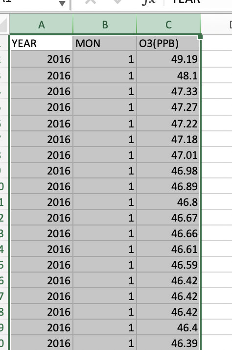
A curated .csv dataset for Ozone can be downloaded below and contains hourly ozone measurements (PPB) at Tudor Hill Marine Atmospheric Observatory.
Click on the button to download the file and open this as an Excel file and save a copy of your data sheet. If the file does not open with each parameter in its own column, proceed to utilize the “Text to Columns” function. Please note that the first column is the year the data was collected, the second is the numerical month (eg. January = “1”) and the Ozone measurement in parts per billion .
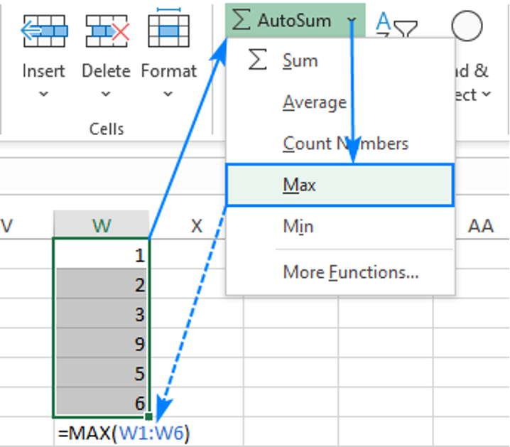
The first thing to explore in the data is to see the range. You can calculate the maximum value by utilizing a few simple commands.
In the function bar at the top of your screen calculate the maximum and minimum values.

- In a cell, type =MAX(
- Select a range of Ozone measurements using the mouse. In this case click the “C” column in Excel so it will look at the maximum value for Ozone (PPB) in the dataset.
- Type the closing parenthesis.
- Press the Enter key to complete your formula.
- You can repeat the same step to calculate the minimum value, type =MIN(….)
An alternate way in Excel to calculate this is found under the AutoSum function on the Home tab: here you can see a Max and Min function.
Question Prompt
What is the maximum Ozone value (PPB) in the entire dataset?
What is the minimum Ozone value (PPB) in the entire dataset?
Utilizing one additional function to explore what month these values occur in. Copy the maximum value found into the dataset into the “Find & Select” function on the Home tab in Excel.
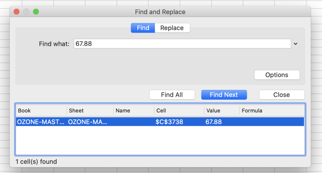
Locate both the minimum and maximum values utilizing the Find & Select function to answer the question prompt below.
Question Prompt
In what month does the highest Ozone value (PPB) occur in the dataset?
In what month does the lowest Ozone value (PPB) occur in the dataset?
Step 5: Pivot Tables for Summarizing Data
A pivot table is a table of grouped value that will summarize or aggregate individual items into table with one or more discrete categories. The summary table has the ability to create sums, averages or other statistics, which the pivot table can group together using a chosen aggregation function that is applied for the grouped values.
To insert a pivot table first highlight all three columns of summary data by clicking Column A, B and C while holding “Shift”.
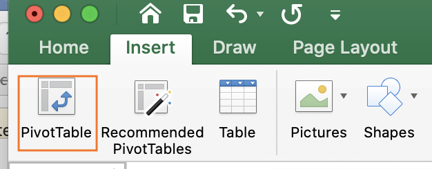
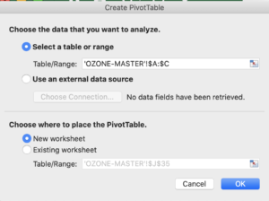
Locate the “Insert Tab” on the top bar of Microsoft Excel and select “Pivot Table” which is the first icon. A Create Pivot Table window will open and confirm the correct data range has been highlighted for the summary. In the query section choose where to place the PivotTable, choose “New Worksheet”. Analysis of the data should be completed in a separate worksheet, to prevent any alterations to the original data file.
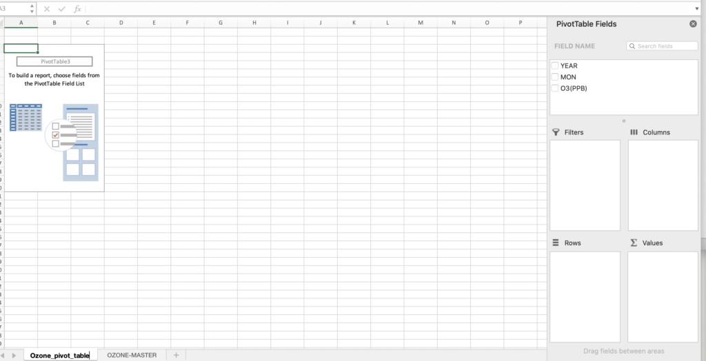
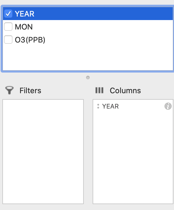
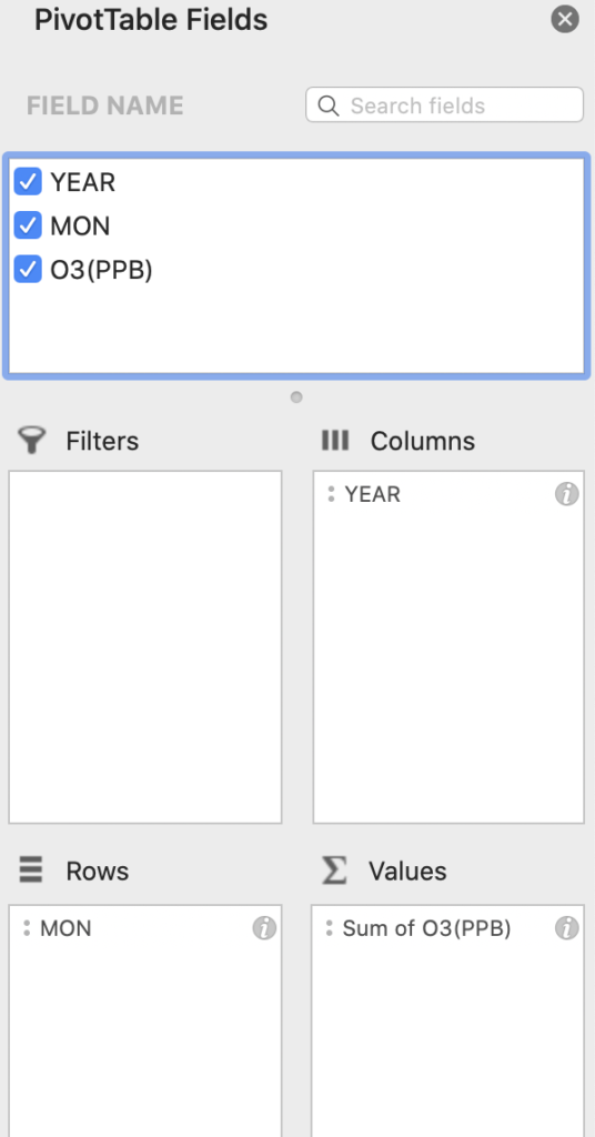
Label the new Worksheet as Ozone_Pivot_Table or similar to begin creating the aggregate summary. Locate the right-hand side panel labelled “PivotTable Fields” and you will see our three metadata headings of “Year”, “Mon”, and “O3 (PPB)”.
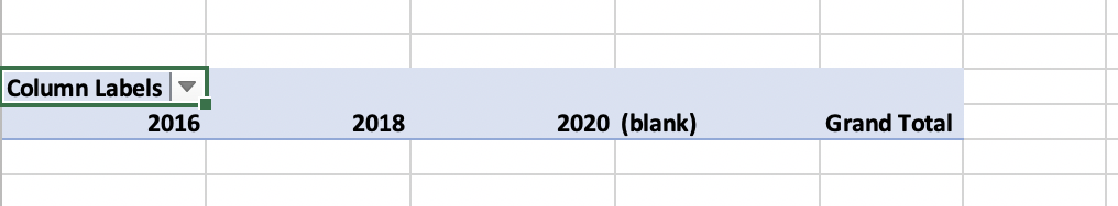
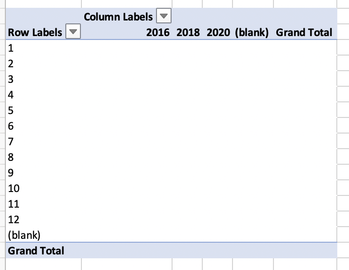
First drag the “Year” data to the “Columns” box and the spreadsheet should look like the below images.
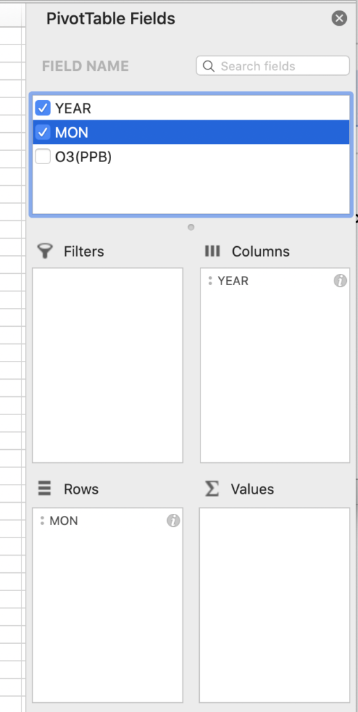
Next, drag and drop the “Month” column into the rows section of the PivotTable.
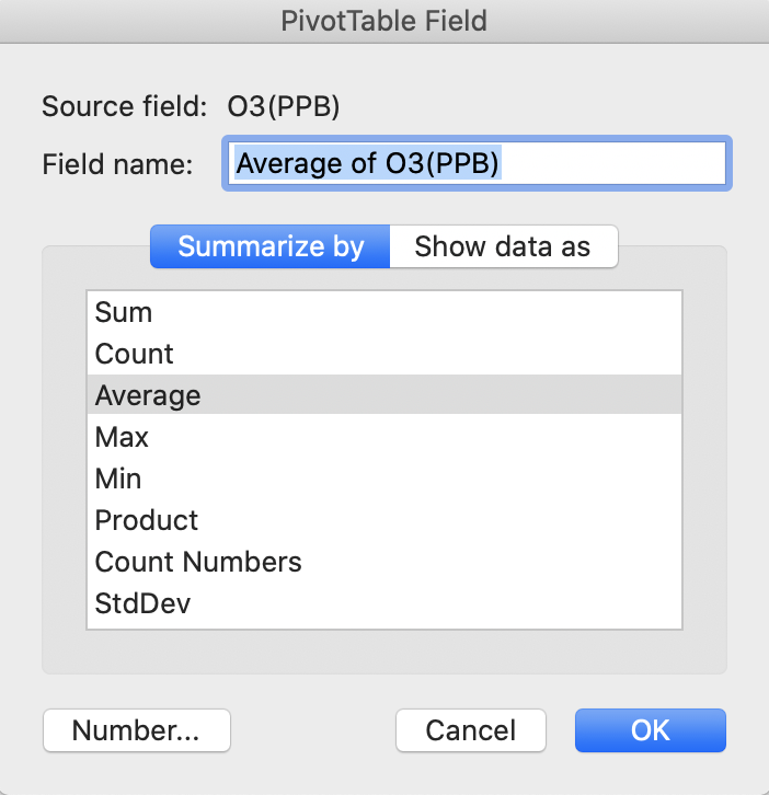
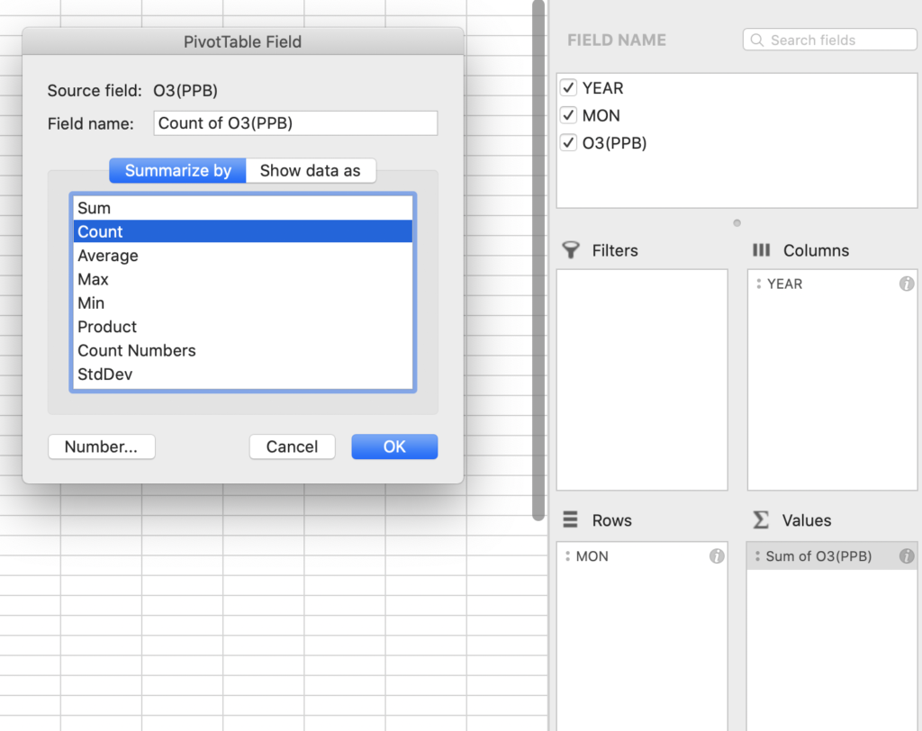
Finally, drag and drop the Ozone values (PPB) to the “Values” panel and click on the “i” in the right-hand corner of the box. The default is to sum the columns and the function needs to be adjusted to Average (or Mean).

The resulting table should look like the below screenshot. If it does not, go back through the steps above to see where the error may be.
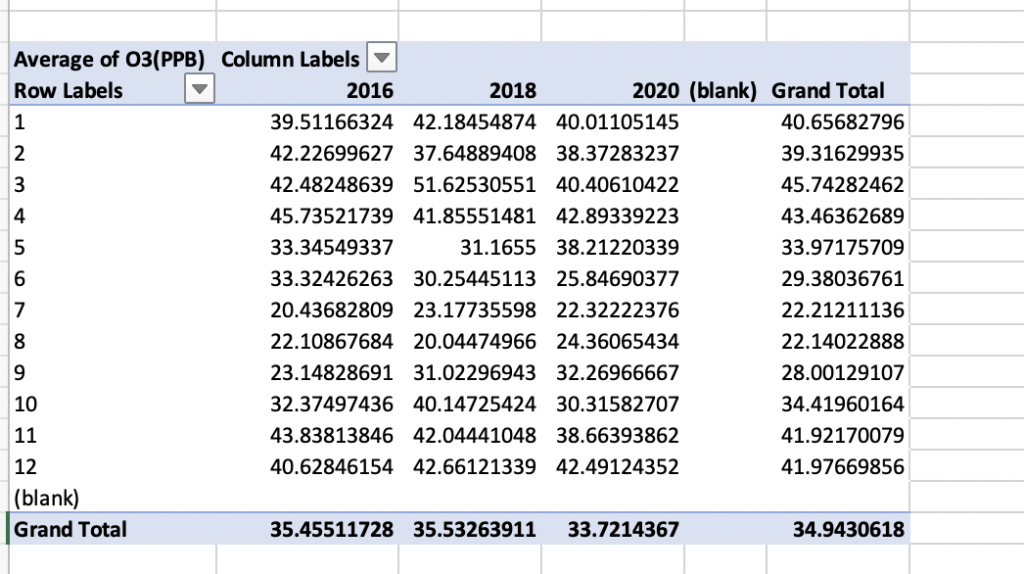
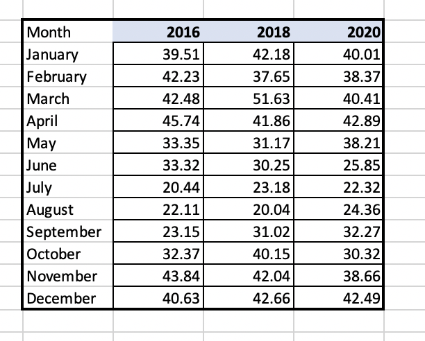
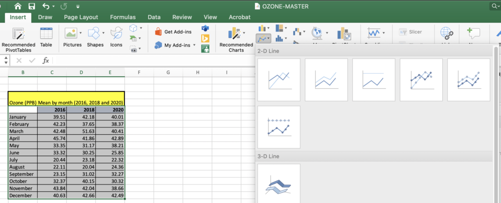
Copy and paste this table over to a final tab called Ozone_final_summary. Next, create a summary table and start by writing “January” in one field. Go to the bottom right-hand corner of that cell until you see a “+” function. Once the “+” appears, drag down the column until you have all of the months of the year. This will simply change the data for graphing so that “1” month corresponds with “January”. Excel links cells by using the “=” function.
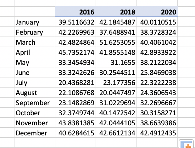
In the first cell under column 2016 and row January, link the value in the summary table “39.511” by entering the cell letter and number (eg. C7) and hit enter. This linked value should appear in the cell. Then use the same “+” to drag this linking formula across and then down to complete the table so all cells are linked to the above summary table. Make sure that Excel has executed this function correctly and has not copied cells instead. The table should now look like the below example.
Return to the original Data Master file and look at the number of significant figures that the original data was recorded in.
Question Prompt
How many significant figures does the original Ozone (PPB) instrumentation report the measurements to?
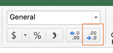
Reduce your data table to the correct number of significant figures utilizing the function outlined in the below located on the “Home” table under “General dropdown” . The summary table should look similar to the below.
Question Prompt
Looking at the data summary table, does Ozone (O3) appear to yield higher values in PPB in the summer or winter?
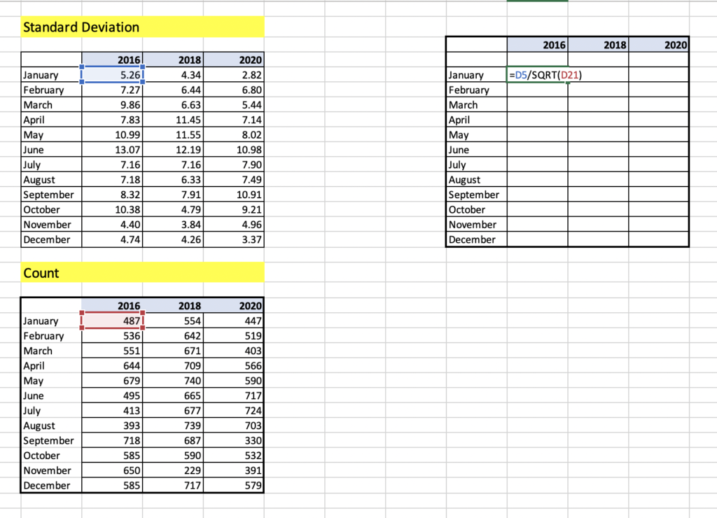
Step 6: Standard Deviation
Standard deviation is a measure of the amount of variation or dispersion of a set of values from the mean (or average) of a set of numbers. A low standard deviation indicates that the values tend to be close to the mean of the set, while a high standard deviation indicates that the values are spread over a wider range. The smaller the standard error, the more representative the sample is of the overall measurement in a given length of time.
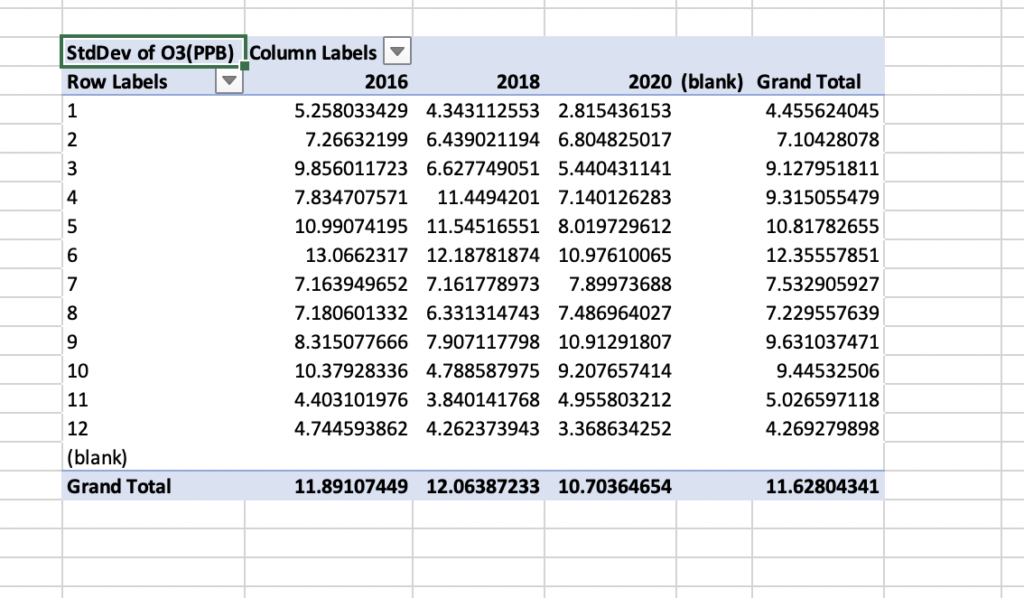
To create a PivotTable for standard deviation, go through the same steps outlined in Step 5 and when you get to the point of choosing “Average” for the O3 values chose StDEV instead. The table should look similar to the below.
As with Step 5, create a final summary table with the correct number of significant figures. When linking the summary table to the PivotTable make sure to use (= and then link to the cell reference eg. C7) and hit enter and drag down and across using the (+) in the bottom right-hand corner of the first cell. The final version should look similar to the below.
Question Prompt
Is the standard deviation higher (more variable) in May or December?
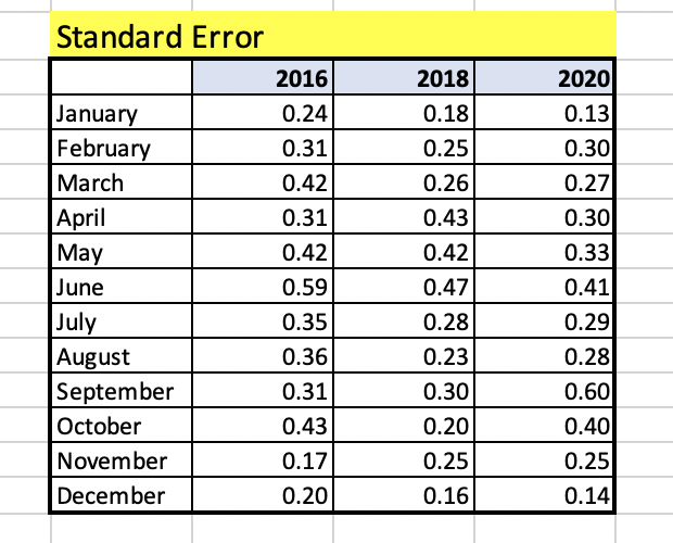
Step 7: Calculating Standard Error
The standard error is traditionally the statistic that is reported utilizing error bars on graphs. This statistic serves as a measure of variation for random variables, providing a measurement for the spread. The smaller the spread, the more accurate the dataset. The relationship between the standard error and the standard deviation is such that, for a given sample size, the standard error equals the standard deviation divided by the square root of the sample size.
SE = σ / √n
Where:
- σ = the standard deviation
- √n = the square root of the sample size
In the case of the Ozone data presented, the sample size is the number of Ozone (O3) readings taken in each month. This can be calculated easily with the “Count” function within PivotTables.
To create a count table, repeat all steps as done in Step 5 (Average) and Step 6 (StDEV) and instead choose “Count”.
Complete the same steps to create the summary table as in step 5. These numbers represent the sample size in each month and year for Ozone and will be utilized to calculate the standard deviation manually in preparation for the final graphing function.
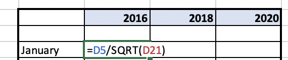
Calculating the standard error will be done manually by taking the standard deviation that has already been calculated and dividing this number by the square root of the sample size which was calculated using the “Count” function in this step.
Create a new sheet to calculate standarad error and copy the final summary table for standard and deviation and count. Make sure to copy and “paste special” and select “values”. Double check to make sure that the table has copied correctly across. Create a summary table for the values to be calculated in for each cell.
- Take the standard deviation cell and click on it and then add the divide command “/”.
- Add the command for square root SQRT(…..)
- Next click on the corresponding count cell which is the sample size
- Hit “enter”
- Utilize the auto fill option by using the (+) in the bottom right hand corner of the first calculated cell and drag across and down.
Question Prompt
What is the sample size in January of 2016?
The final summary table should look similar to below. If it does not, ensure that all of your values are copied and that paste special “values” was utilized to copy values. It is also valuable to go back to make sure that all cells were linked properly versus.
Step 8: Creating a Graph
Graphs are a data visualization tool that are an effective way to present information quickly and easily and are commonly used for print and electronic media. Graphs can reveal trends and comparisons that may be difficult to visualize in a table.
To create the final summary tables for graphing you will need two sets of values.
- Mean/Average Ozone (PPB) summary table
- Standard Error for Ozone (PPB) summary table
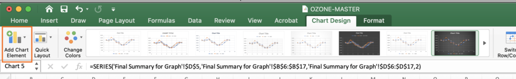
To create the graph you will copy and paste these two summary tables into a new worksheet named “final_summary_for_graphing”. Highlight your summary data table including averages for months and years for Ozone (PPB). Navigate to the Insert tab at the top of your Excel window and choose “2D line” and chose the first option.
The second step is to add the standard error to each individual year. Navigate to the Chart Design in the icon in the bar at the top of your screen, select “Add Chart Element” and select “Error Bars”. A window will come up to select which series to add Error bars to. Select “2016” and select “ok”.

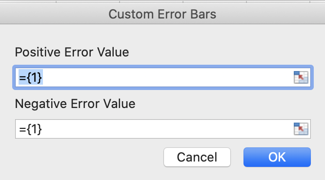
The error for each data point in each month of each year has already been calculated around the mean manually in step 6. To customize the error bars based on calculations navigate to the far-right hand side of the screen to select “Custom” and select “Specify Value”. Ensure that there is a location to add the positive and negative values or “tails” of the error bars by making sure that “Both” is ticked under the “Directions” section of the error bar formatting.
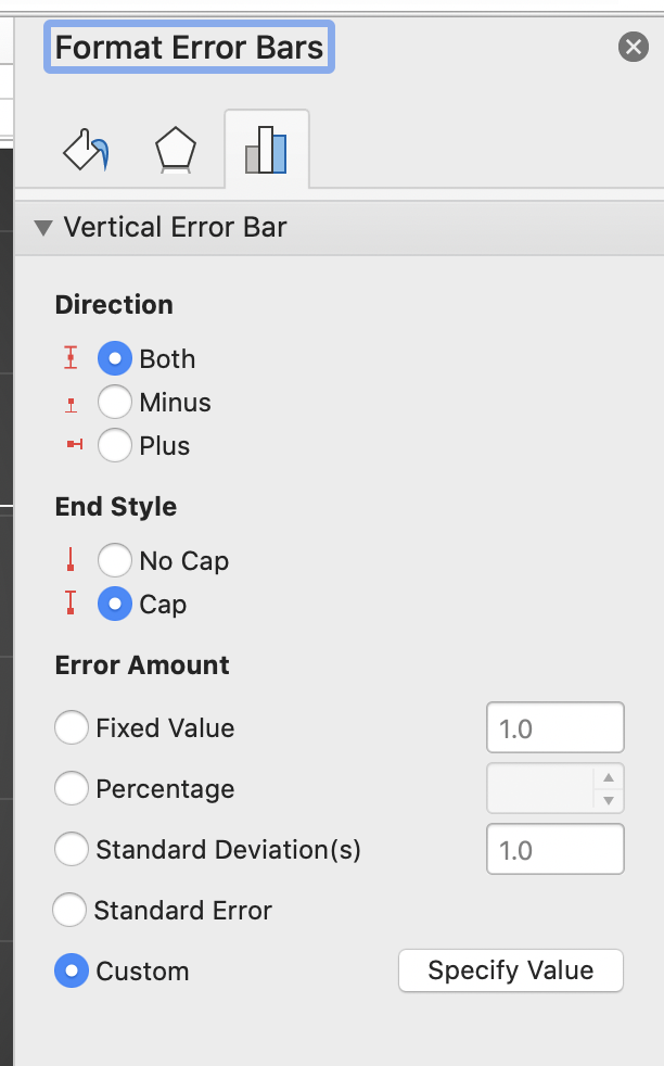
The Customize option will allow a space to highlight both the positive and negative (January – December). Please note as this is normally confusing. To add the (+) and the (-) side of the error bar, select the same column of data Jan-December for 2016 for both (+) and (-) error value.
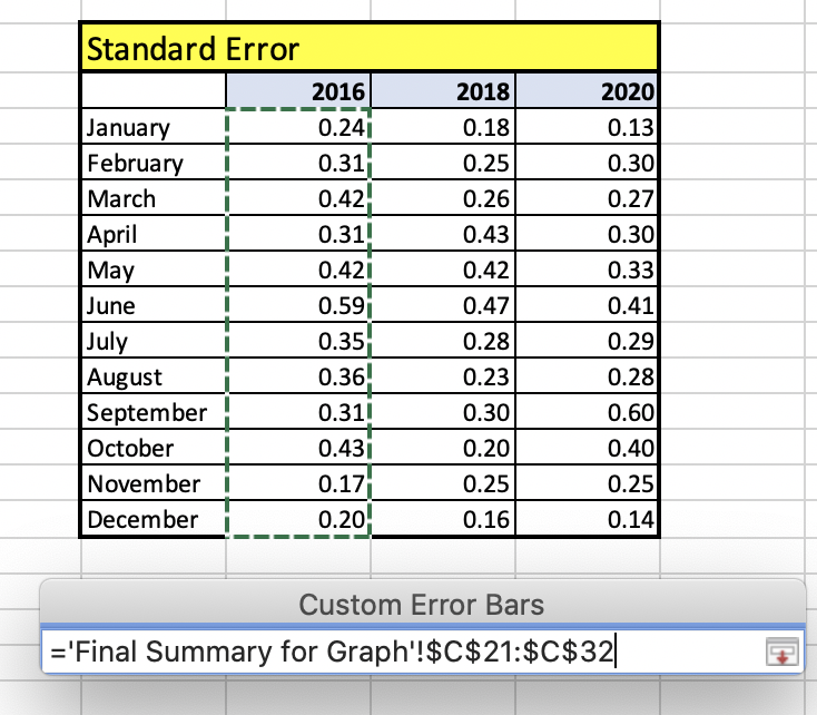
Proceed to add error bars for 2018 and 2020 data series utilizing the same steps as above. Select the chart element icon to add axis titles to the primary vertical and primary horizonal axis with units and add a descriptive title at the top of your graph. Save the graph as a .PDF to hand in or for further discussion in class. Ensure font sizes are legible for the reader.
Step 9: Making Conclusions from your Data
Question Review
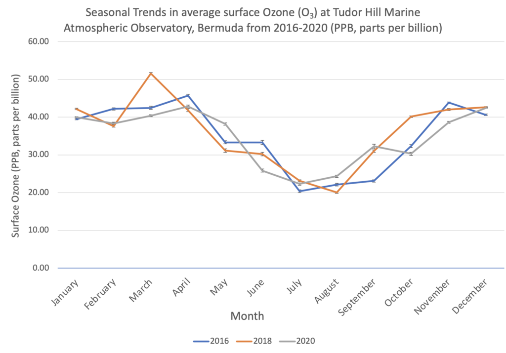
In which season is Ozone lower in Bermuda the summer or winter?
Final Summary:
How do these data compare to the Ozone trends in other locations? Explore some datasets at other latitudes in DataViewer?
https://gml.noaa.gov/dv/iadv/index.php
Bermuda, like other locations experiences seasonal variation in Ozone concentrations. Hypothesize why this may be?.
https://gml.noaa.gov/dv/iadv/index.php
Resources
- Atmospheric Research Over the Western North Atlantic Ocean Region and North American East Coast: A Review of Past Work and Challenges Ahead
- Earth Null School – Mean Sea Level Pressure Model for looking at the Bermuda and
Azores High locations seasonally - Stratospheric versus pollution influences on ozone at Bermuda: Reconciling past
analyses - Three-dimensional view of the large-scale tropospheric distribution over the North
Atlantic During Summer
Step 1: Coming Soon
Step 2: Coming Soon
Step 3 l Practicing Text to Columns in Microsoft Excel
Any of the datasets explored could be imported into Microsoft Excel for manipulation to better understand annual and inter-annual trends in surface Ozone. In this lesson, participants will practice bringing in the data from the NOAA data repository into Excel.
First, choose a year and month that you are interested in exploring. In this example, January of 2021 was chosen. Highlight the entire dataset and utilize control “C” or Command “C”.
Open a Microsoft Excel workbook or free version (eg. LibreOffice) and paste or paste special or “Control V” / “Command V” . Due to data being stored in the repository as a text file, all the information will copy into one column. The Text to Columns function located under the “Data” tab in Excel will allow you to separate the data by delineated column width so that each piece of metadata heading has its own associated column. The text to columns function becomes very useful for importing data in repositories that is stored text format.
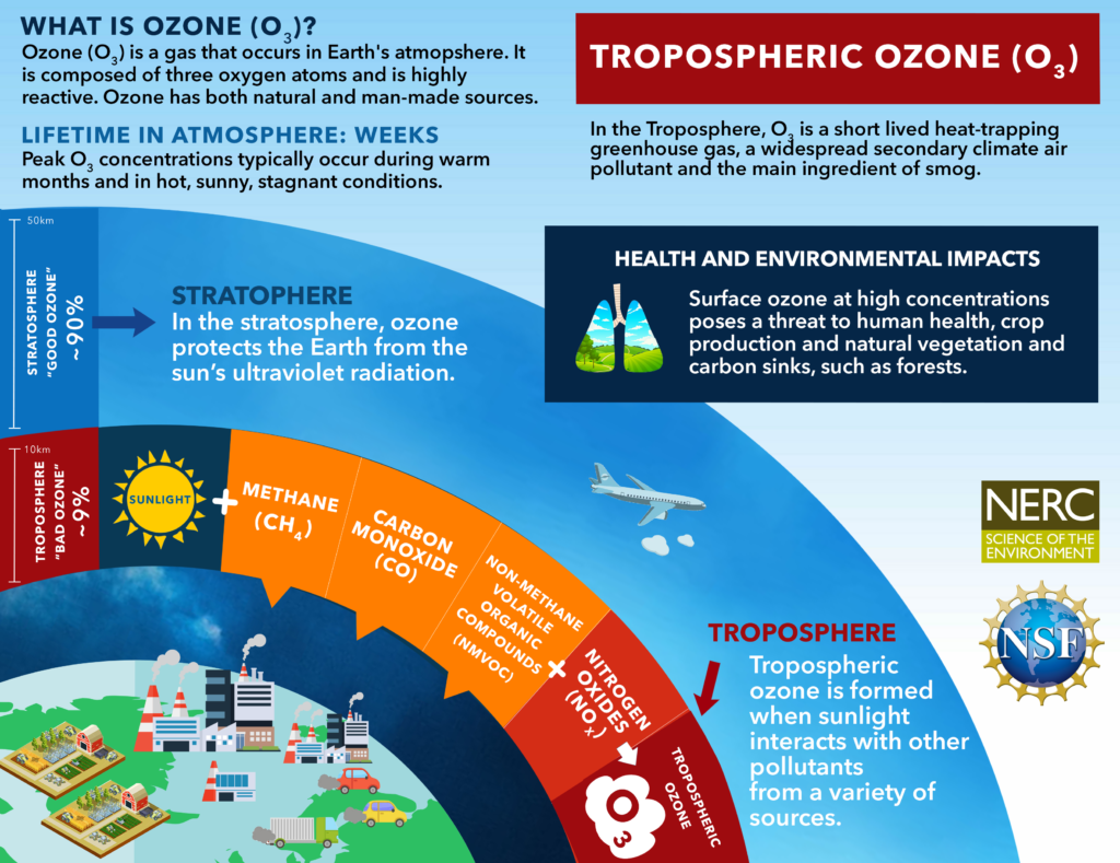
Ozone Schematic
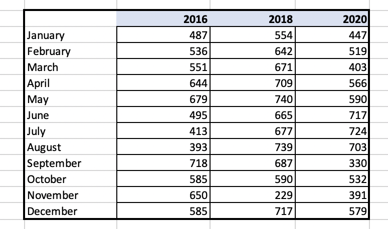
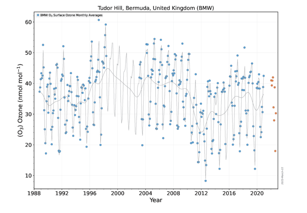
Surface Ozone (O3) record for Bermuda
Surface Ozone (O3) record for Bermuda (1988-Present)
(Data Source: NOAA’s Earth Systems Research Laboratories)
Virtual Tour
How is the atmosphere sampled weekly at Tudor Hill Marine Atmospheric Observatory?
Tour of Tudor Hill Marine Atmospheric Observatory from Kaitlin Noyes on Vimeo.
Resource Links
- MET Office United Kingdom – Jet Stream
- NOAA Jet Stream
- Tropospheric Ozone Assessment Report: A critical review of changes in the tropospheric ozone burden and budget from 1850 to 2100
- Tropospheric Ozone Assessment Report (TOAR): Global metrics for climate change, human health and crop/ecosystem research